We are getting ready for our summer holiday to Sandpoint Idaho to visit my Father later this month. This an annual event we always look forward to. Anticipating this I was reminded of last year’s visit and decided to look through some photos I took and found some I wanted to print.
The camera I used was my Fuji GSW 690 which has a 65mm lens and a 6x9 negative. In previous posts I have discussed the challenges of printing these negative on my 6x6 enlarger. Basically I can only capture up to 2/3rds of the negative. The photo in question was shot on Kodak Tri-X 400 film.
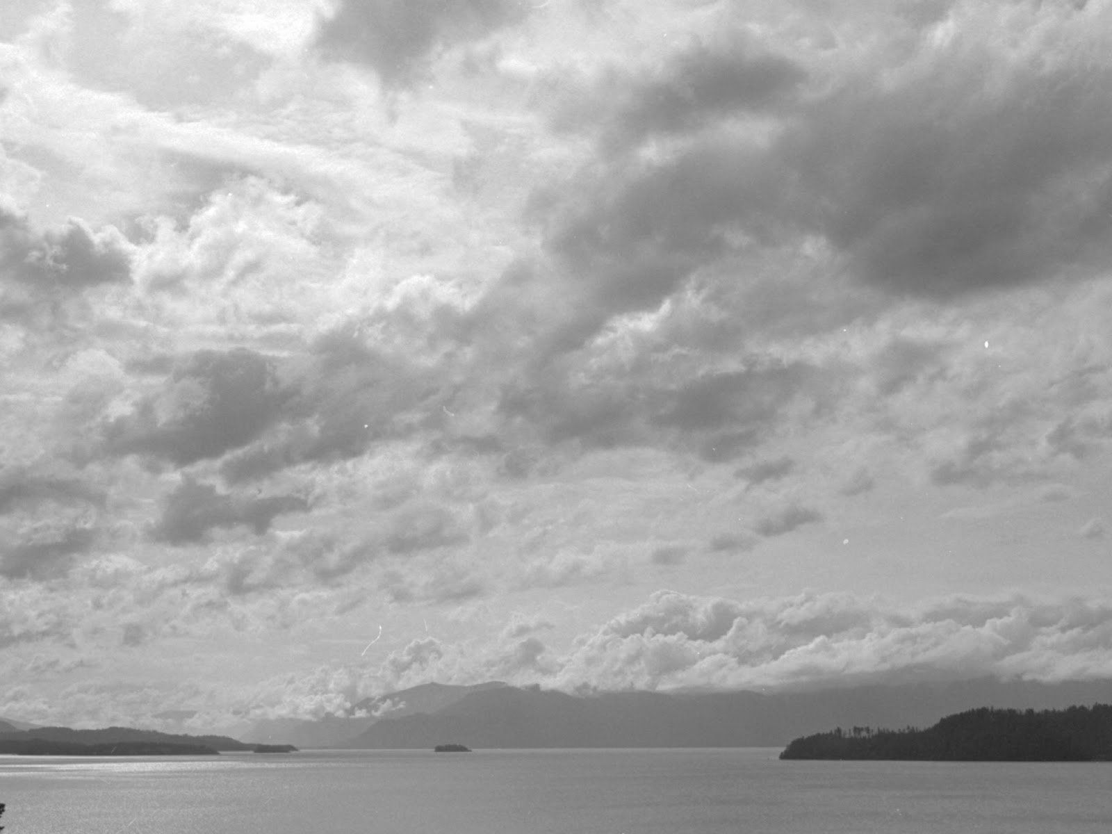
Here is the original photo.
 |
| Original negative |
It was taken from the highest point in the house but has a lot of foreground distraction. What attracted me to the shot was the cloud and bright sky mixing with the Monarch mountains on the horizon and the water. So I settled on a severe crop to get what I wanted. A benefit of medium format is this ability to crop and enlarge without introducing a lot of grain. I started printing on Ilford MGFB Classic at 12x16 inches. Later I plan to print on MG Art 300 paper.
Methodology
My methodology is typically to to start by downloading candidate photos from my Flickr account onto my iPad. Here I can experiment with different crops. For instance since I am printing on my 6x6 enlarger I first select a square crop. Then since I am printing at 12x16 I crop what remains at 3:4. Sometimes I play with exposure and contrast to see where the print goes. In this case I know what I want is close to the scan. All of this I can do on my sofa or while traveling. I then have a backlog of darkroom work to keep me busy.
Here is the first crop I composed on my iPad followed by the crop I decided on in the darkroom after reconsidering inclusions of the tree from the mid-ground.
 |
| First planned crop |
 |
| Final crop |
Looking at this again I can see the advantage of including the tree on the left in the first crop plan. I get more of the sky and it radically changes the sense of scale of the image. I think I will revisit this crop in retrospect.
The challenge in this print is contain the full range of tones from the bright sunlit upper left corner to the full complex tone and contrast expressed throughout the image.
Process
To print this I ran through my familiar process. The beginning of this ritual is probably the most frustrating. That of removing dust from the negative carrier that sandwiches the negative between two pieces of anti-newton glass. This I do with a small flashlight beam grazing the surfaces I want to remove dust from. This makes the dust apparent and I attempt to blow or wipe with a cloth most of it. (I also have an air cleaner that I relocate to the darkroom as well to reduce the amount of dust floating in the air.)
Once the surfaces are as clean as possible I lock the two sides together and slide it into the enlarger. Next are the usual steps of adjusting the easel, enlarger height and then focusing with a grain focuser. I remove both ND filters and open the aperture up to make the image as bright as possible.
Finally I confirm the crop, make sure the horizon is aligned with the bottom easel blade and then check all the edges of the print. What I am looking for here are 1) the image overlapping each side of the easel to ensure I don't have a black or white stripe right along the edges. 2) make sure no stray image elements are present that distract from image. All too often a branch or leaf interferes with the edge and is only apparent when assessing the final stage of the print. This is the case for example in the second crop model image above. In the lower left corner a bit of pine bough disturbs the balance and makes for an unnecessary distraction.
Next I need to set the 'base' soft filter exposure. This required two test strips to get in the right range of exposure. I started out like my last print with two 1 stop ND filters (I use a 150 watt bulb rather than the normal 75 watt one in my enlarger) and set the aperture at f11. My first test strip with the soft filter showed the most likely exposures around 45 to 64 seconds. I wanted to pull this in to nearer 32 seconds so I removed one ND filter.
Removing one ND filter brought the base soft filter exposure into the 22-32" range. I guessed at 32" based on the small test strip and then ran a full sheet. This sheet I exposed under the soft filter at 32" and then ran test intervals of 1/2 stop on the hard #5 filter. From right to left are 0", 8", 11", 16", 22", 32", 45", and 64". From this I can assess the impact of the soft filter on the image as well as slices of increasing high contrast exposure of the hard filter. This led me to select 45" for the hard filter. I made another full sheet as follows.
I assessed the result. The upper left corner which is where the sun is lacks any detail or local contrast. Most of the rest of the print looks OK. I opt to burn that corner with the soft filter at 1/2 stop (16" in this case).
- 1xND
- f11
- #5 45"
- #0 32"
- #0 16" burn upper left corner 1/2 stop
I made that print as a full sheet. The result was quite good. I did opt for a full 3 minute vs the normal 2 minute development time to bring out the lightest shadow detail in the clouds. In my test printing I was torn between 45" and more for the hard filter as the darker clouds became more dramatic on the 64" hard filter exposure. I was concerned however that I would over-do this for the land and lake as I like the tonal separations I have there. Also the hard filter is hardest to manipulate as the switch from black to white can happen within the space of 1 stop of exposure. So I opted to try a burn of the clouds at 1/4 stop or 16 seconds. Along with same soft filter burn from the previous print.
- 1xND
- f11
- #5 45"
- #0 32"
- #0 16" burn upper left corner 1/2 stop
- #5 16" burn above mountains 1/4 stop
This print came out well too with the extra drama in the darker cloud bellies.
My notes here
 |
| Notes on print work and burn plan sketches |
The burn plans summarized below.
 |
| Burn Plans |
Here are the prints...
 |
| This is the first print with only the left corner burn. (Ilford MGFB Classic paper) |
 |
| This print adds the hard filter burn to the sky (Ilford MGFB Classic paper) |
Ilford MG ART Prints
I then went on to print the same image on the Ilford MG ART 300 paper. I have recently tried this paper and am an enthusiastic user of it now. The paper is very expensive however but I have a little trick. I print first on Ilford MGFB Classic paper which is cheaper (2.14 GBP per 12x16 sheet vs 3.42 for ART 300) . Once the print has been dialed in and working I remove 1-stop of ND filter then print the same timings on the MG ART 300 paper. It is a very close match at that point. I can then make small adjustments to the exposure and thus use less of the expensive paper. For example I made the following print using this formula.
- 0xND
- f11
- #5 45"
- #0 32"
- #0 16" burn upper left corner 1/2 stop
 |
| MG ART 300 Paper |
The print is slightly darker but very close. The paper is not starkly white like normal Baryta-based fiber paper. The cotton rag base is slightly warm in tone. This and it being a matte finish reduces somewhat the contrast.
New Crop
As I mentioned above while reviewing this post I became more interested in my original crop plan for this image. With this is mind I adjusted the crop which required me to move the enlarger head down by 2 cm. Knowing this and the previous print was already a little darker than the FB one I took the exposures for hard and soft down by 1/4 stop. The print formula is as follows.
- 0xND
- f11
- #5 38"
- #0 27"
- #0 13" burn upper left corner 1/2 stop
The result here.
 |
| Crop with Tree in mid-ground. (MG ART 300 Paper) |
I am fascinated how adding this one compositional element changes the scene. My preference is the one with the tree. My personal impression is the tree adds scale. It also shifts the point of the focus from the bright space in the upper left corner in the first crop to a tension between the brightness in the middle and the dark tree in the lower left. I think this composition is more balanced.
The second print is slightly lighter than the previous. The 1/4 stop reduction went too far in terms of trying to match the two prints. It is interesting that I am suddenly confronted with the idea of how to deal with smaller increments than a 1/4 stop. I think this is due to my attention to more printing details. I now start to think about how to revise my timer software to accommodate this.
Epilogue:Printing as Therapy
This printing session I initiated one night after a particularly challenging day at work. I rode my bike home worried and upset and after dinner while watching some television I started planning the printing on the sofa. Very soon I felt the darkroom calling and after an hour and half had produced a couple of satisfactory prints. I found it very therapeutic. I could put all the worries of the day aside and concentrate on crafting something of beauty.
The attributes of a good hobby are that it always stretches and challenges you and absorbs you to an extent all else is pushed from you mind. Photography can do that for me. In the past fly fishing was the thing for that and before that woodworking.


Comments