Posts

Showing posts from 2023

MorseBlog is moving to SubStack

For various reasons I am moving to SubStack as my new blogging platform. I will move content over as I have time. In the meantime, I will keep the old Blogger site called Morseblog available.  Please come follow my activities here on SubStack . 

Film from Digital Prints: Comparing Ilford MGFB Classic and Fomatone MG Classic Warmtone

Image
I have been experimenting with Fomatone MG Classic Warmtone paper recently. I have found it has a pleasing look when developed in ECO 4812 which is not a warmtone developer. It maintains a warmer tone that can verge on green in some light. I do not like green toned prints and have remained confused as to why this is considered a warmtone.  However this paper has grown on me. Along the way I have tried some toning, and this can clean up any residual green tone if it becomes too bothersome. The paper tones well in sepia toner if more brown tone is desired.  As part of this process, I decided to investigate the same print on Ilford MGFB Classic which is a neutral to cold tone paper. This is my usual paper which when developed with Eco 4812 developer has a nice neutral tone. This paper does not tone well in sepia . A very small amount of sepia takes the colder 'edge' off the print, but further toning gives a cloying pinkish tone. As an aside Ilford MG ART 300 paper gives a much nic

Rescuing Old Paper: Negra Portrene

Image
When I first began to learn printing in the darkroom, I went through a phase of picking up different expired papers. Partly because they were cheap and also to experience what the properties and history of these old papers were like. Eventually I came to the conclusion that most papers are too fogged to be worth the effort and whatever characteristics they had once have long since diminished with time.  Of course, I use a number of these for lith printing and toning with some great results. Papers like Fohar Raster with an embossed pattern of dots I suppose was to suggest the idea of a CRT? ORWO, Oriental Seagull, Agfa-Gevaert Rapidoprint are some other examples. One paper that stood out for me was Negra Portrene made in Barcelona. At the time I bought some I researched the paper as best I could here ... and determined it went out of business in the 1970's when Spain was still ruled by a fascist dictator.  I bought the paper because it was unopened and 16x20" and I wanted to t

Lith Printing Nerga Portrene

Image
I have returned to this old paper recently and have decided to try lith printing it again. It is a single grade warmtone paper from the 1970's. When I first bought it I found it lithed well and this has been born out again. I used Fotospeed Lith developer in that first trial and now I use Moersch EasyLith and have learned a bit more about lith printing since then.  Everything I learned in that original post bore out in my work today. The paper develops really fast in hot lith developer within seconds for the first print at a +3 stop overexposure. The developer settled down as the developer cooled and I reduced the exposure. I actually managed to get good prints (indeed the best) with very little exposure. As a gauge of this a reasonable conventional print was made at f8 for 32 seconds. The second print was made with less exposure at f8 for 22 seconds.   I used a negative from my Fuji GFX 50s ii digital camera made at Gammatech . This was an image I took at night during a snowstorm

Film from Digital Prints: Toning

Image
A few days ago, I completed a set of prints on Fomatone MG Warmtone paper. Mostly to see what this paper was like and to print another film negative made from a digital image. The negative was one I made with my Fuji GFX 50s ii digital camera then had converted to a 4x5 negative by Gammatech in the USA. This I then printed conventionally in my enlarger.  For this project I bought a pack of 10pcs of Fomatone 9.5" x 12" paper. The first sheet was for test strips and then a couple of initial prints before I had what I liked. The remaining sheets I printed at two different exposures. In general, the tail end of such a small packet of paper would not be sufficient to complete another print unless I got lucky. I also wanted to experiment with some toning of the paper so having a number of prints to play with helps me explore the toning topic more.  Toning The basic strategy I decided to pursue was some basic split toning. In general, I find toning is less chaotic than lith printi

Film from Digital Prints: Fomatone Warmtone Paper

Image
Another print in this series of digital images made into negatives for conventional silver gelatin prints. You can find earlier incarnations here ...  Blog Post Image This time I decided to experiment with a warmtone paper. The genesis of this was that I noted, and Andrew Sanderson master printer prints exclusively on Ilford Warmtone paper. I have a bias towards neutral tone papers and developer, and I typically use Ilford MGFB Classic with a very white baryta paper base or Ilford Art 300 paper with a cotton rage paper that is slightly warm in tone. I use Moersch ECO 4812 developer which is a neutral developer on these papers.  I do not know the reasons for Andrew Sandersons choice but there are some printers that prefer a slightly warm tone and will add a barely noticeable sepia tone to a finished print. It is also possible that it provides more opportunity for toning generally. So I thought why not?  I do not have a warmtone developer however so there is a limit at this point to the

More 'Ma': Film from Digital Print: Part II

Image
Another print from this series that emphasizes negative space using film negatives created from a digital image.  I made a series of images on the same foggy morning on Lake Pend Oreille in Idaho. There was some ice on the lake and a shifting fog obscuring and revealing the far shore.  I find foggy images exceedingly difficult to print and there can be many interpretations of an image as a result. ( Here is an example of one such exploration of the range of a print's possibilities.) The difficulty stems from the lack of ability to manipulate the contrast using multi-grade paper. There is a limited contrast range achievable even from the highest contrast filter. The negative itself has a very compressed range of tone due to the subject matter. (This is perhaps where digital can excel however the limited range is inherent in the image and even digital can create visible quantization effects unless one is careful in post processing. ) There are other techniques to improve the contrast

Sand Creek Lith Prints: Lith Prints from Digital Images

Image
This is a series of prints made from my 'Lower Sand Creek in Winter ' project that I worked on last winter. The images were taken on my Fuji GFX 50s ii digital camera using a Fuji Acros film simulation. I also restricted the cropping to Xpan (65:24) aspect ratio and I used a Tokina 70-210mm f4 zoom lens on an Olympus mount for their 35mm cameras. I further twisted the methodology by making film negatives from these digital images. (A series of blog posts here ...) I made some conventional prints in the darkroom. Now I am making some lith prints from these negatives. Some of the images work better than others as is typical with lith printing.  For this project I broke out an old batch of obscure paper from Agfa called Rapidoprint. This paper was used in newsrooms to make fast prints on a special machine. It is a single weight paper and may have incorporated developer. I first used this paper in 2015 and though very fogged it did lith reasonably well. I am using Moersch EasyLith

Existence

Image
I was reading Lafcadio Hearn and was recollecting back to one late night’s walk this past winter. The air was cold and dry and the sky cloudless and moonless with bright stars piercing the sky like bright shiny nail heads. Above me were the familiar shapes of Orion, The big dipper, Cassiopeia, Taurus, the Pleiades. These constellations sat lower on the horizon as I thought back to my younger days in Flagstaff and remembered looking at them on many a similar night so many years and miles away. In the moment I was struck with a sense of connectedness not just with my old hometown and my youth but with everything. It was as if my mind, for a moment, expanded and took in everything. Rather than being terrifying or overwhelming it was calming and satisfying. Then as quickly as it came in a few minutes the feeling was gone. I have returned to the same place at a similar time of night and gazed at those same heavens and have not felt moved in the same way. Still, I feel reassured that I can l

More 'Ma': Film from Digital Print

Image
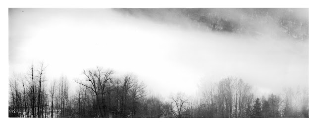
On my pursuit of negative space images, I find these are hard to plan for and one must try and be alive to the idea when they happen. This one I captured on my regular winter walks through town. I was shooting in a black and white mindset with my Fuji GFX 50s ii digital camera set to a 65:19 aspect ratio. This is my favorite setup to use. Presetting the camera in this way mimics some of my film exploits and lets the mind settle on a certain style by removing choices. Fixing the aspect ratio forces a compositional dynamic that opens up possibilities for me as much as it forces a constraint. In this case the low cloud and fog between the screen of winter trees and the mountain created this veil of mystery and lets one's mind imagine the whole scene. The screen of trees provide some tonal weight to help ground the image.  I had this image converted to a 6x7 medium format negative using the services of Gammatech. This allows me to put it in my 4x5 enlarger. I set the condensers for the

Progress of a Print: Film from Digital

Image
I received another set of negatives from Gammatech the other day. This time I I had the negatives made on 6x7 medium format film. I was partially following my reasoning from another post on the subject where I concluded that medium format would probably yield good images at a more reasonable cost than 4x5 film. Unfortunately, I opted for 6x7 as it maximized the fit of some Xpan (65:24) aspect ratio images but I continued this onto single 4:3 aspect ratio (native Fuji GFX ratio) images and of course I cannot fit these completely in my 6x6 enlarger.  I decided to make a couple of prints cropped square anyway. The print turned out pretty well.  I started with a square 8" x 8" crop from 9 1/2" x 12" Ilford MGFB Classic paper. For some reason that I don't recall I have two unopened 50 sheet boxes of the stuff. This gives generous 3/4" borders and a large blank border on the bottom which lends a kind of balance to the print. So, I retained this 3 1/4" botto

Drip Development

Image
I got to thinking about how to create images that incorporate this Japanese concept of 'Ma'. The idea that what isn’t visible is as important as what is. The Wikipedia entry for 'ma' gives this image by Hasegawa Tohaku as an example. It can be hard to find images that incorporate this idea so I thought how I could achieve this in the darkroom.  Pine Trees by Hasegawa Tohaku Inspiration for this process. I took a recent print... Example print of starting point. I had made and then exposed a fresh sheet of Ilford MGRC paper with this same image. I placed this exposed paper in a tray and added enough water to keep it just under the surface.  Next, I took a pipette and loaded it with about 5ml of developer (Moersch ECO 4812 1:10) and dribbled the developer over the exposed paper. In this first example I tended to focus on the first pass along the long central axis. One wants to be careful not to disturb the water bath too much as the objective is to keep the developer conce