Posts

Showing posts with the label Black and White Prints

Drip Development

Image
I got to thinking about how to create images that incorporate this Japanese concept of 'Ma'. The idea that what isn’t visible is as important as what is. The Wikipedia entry for 'ma' gives this image by Hasegawa Tohaku as an example. It can be hard to find images that incorporate this idea so I thought how I could achieve this in the darkroom.  Pine Trees by Hasegawa Tohaku Inspiration for this process. I took a recent print... Example print of starting point. I had made and then exposed a fresh sheet of Ilford MGRC paper with this same image. I placed this exposed paper in a tray and added enough water to keep it just under the surface.  Next, I took a pipette and loaded it with about 5ml of developer (Moersch ECO 4812 1:10) and dribbled the developer over the exposed paper. In this first example I tended to focus on the first pass along the long central axis. One wants to be careful not to disturb the water bath too much as the objective is to keep the developer conce...

Yakisugi Frame

Image
If you have been paying attention to woodworking and building topics recently you will know that a Japanese wood preservation technique called Yakisugi  (sometimes misnamed Shou Sugi Ban based on a mispronunciation apparently) has become popular. The technique involves burning the surface of the wood which leaves it charred. Technically it is applied to Japanese cedar but can be applied to other woods. The burning has a couple key benefits in terms of  wood preservation. Burning removes nutrients like sugars and cellulose from the wood surface. The charred wood is also water water resistant. If you have hiked in an area where a forest fire had burned you may have noted how the charred wood surfaces retain their integrity. The technique is all over YouTube on woodworking channels as everyone is always scrambling for new content topics so a quick search will find innumerable sources of ideas.   I came upon this in a upcycling TV show where an oak desk had the tech...

Framing and Displaying More of My Work

Image
I think that there are many important parts of Photography that have been lost in the digital age. One of the more notable is that most work is displayed and seen on a screen. While this has had the obvious benefits of allowing more people to see more artist’s work it feels to me too impersonal and lacking in reality. I have spent my career in technology and spent most of that time understanding semiconductor chip development, software, and markets. In fact my most recent work focused on display technology so I am comfortable and well versed in image digitization and pixels and RGB and bits per pixel and resolution and compression. So this comes not from some fear or misunderstanding of the technology but more from my heart.  My need to involve more of my senses in photography has extended to other hobbies such as woodworking. There is something immensely satisfying in an activity that involves the brain and the hands. There is such a satisfying and intimate connection between the ...

More Physical Split Printing and Toning Results

Image
I moved on from my previous post to try some more ideas I developed as I worked on those prints. I decided to try and make a higher contrast film and a toned film. New Film Versions Higher Contrast: Expose f8 11 seconds full development 3 mins Eco 4812 Bleach 1+10 for 5 minutes. Fix 1 minute.  Selenium toned: Expose f8 11 seconds develop 45 seconds. Selenium 1+3 tone about 1 minute for purple tone.  The trouble I soon find is that I have a lot of combinations that are possible now as I can mix and match papers and films. Below is the comparison matrix. The bottom row is the same from the previous blog post. A map is offered below to help describe what the variations are.  Summary Table Legend for Image Matrix Thoughts on the Results A couple of things come out from this. 1) The higher contrast film allows more of the underlying image tone through. 2) A toned mask tends to dominate the overall color. This is in part because the negative is high contrast and as such the ma...

Physical Split Printing and Toning

Image
Introduction I have long been a fan of split filter printing where you expose the paper with a low contrast (soft) filter and then a high contrast (hard) filter. The balance of exposure times give the degree of contrast one wants. I find it a more intuitive and easier system than hunting for the right filter value. It also allows more dodging and burning control.  Recently I have been exploring toning and there is a split idea here too. Toning with two different toners to change the warmth and character of the image.  Thirdly a few months ago I stumbled upon a technique I called Lith-Lith where I developed a Ortho Litho film with lith developer aiming to get a higher contrast image. This failed, however I did get a sepia colored transparency that I mounted in front of some aluminum foil to produce a spectacular result.  This led me to think about how to combine these techniques. I had run out of my original Orth Litho film from Photowarehouse in the US and with no prosp...

Framing Some Recent Prints: A Good Day

Image
My wife says she likes watching me working in the shop as I seem so focused and relaxed. She is right. Yesterday was a good day like that. A morning bike ride, then breakfast and out to the shop for a shortish project I dreamed up the day before. Some of my recent square prints were begging for frames and to be displayed.  So I found myself out in the shop most of the day fashioning them from scraps of pine I had laying about. I used nothing but hand tools so the work was quiet and contemplative. Japanese hand saws, a rabbet plane, smoothing plane, and a chisel were all I really needed. The work was small and delicate as the frames were small and I wanted them to be light and simple.  I had Jackson Browne's Solo Acoustic Vol 1 and 2 playing. An excellent album I only recently discovered. I grew up with his music but never owned an album of his. None of the songs were ones I was familiar with but that didn't matter. His rapport with the audience makes it all the more interestin...

Double Vision

Image
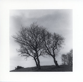
While making a print earlier my first test strip moved during the exposure of the test strip. In looking at it more I decided I liked it. The subject was the three trees from North Wales.  Original print The test strip is here below.  Inspiration! I decided to try this formally as an image. I considered how to shift the image. The shift in the test strip was from flattening the curl in the paper. This has the potential advantage having the two images pivot from the ground. I rejected this though as it seems harder to control and there will be a loss of focus. Still it is worth thinking about as the result may appear more like a shadow which could be useful. I decided on a simple horizontal shift. Since the original print was almost entirely the full horizontal range of the negative I needed to create some space for the shift. I cropped the image in tighter to make room. Since it is a square image I lose some sky but I shifted the crop up to have less ground in the foreground....