Posts

Showing posts with the label ECO 4812

In Praise of Moersch ECO 4812 Developer

I just mixed a fresh batch of ECO 4812 (1+10) and looked at my notes. This last batch was mixed back in February. Finally, development times were running past the customary 3 minutes hence the fresh batch. I am reminded why I have enjoyed this developer for so long. I am also reminded of Wolfgang Moersch' s own words about his developer... After 20 years of experience with the creation of developers it is time to break new grounds. Modesty and self-effacement are inappropriate. While others beat the drums and blow the horns, a flute would be too silent to be heard: ECO 4812 original “eau de Hürth” is my best positive developer and thus probably the best developer on the planet. Hurth is the town in which he resides. For me the benefits have been 1) a neutral tone as I don't generally like warmer tones, 2) Very economical, 3) Ecologically friendly As far as economy is concerned, I spend time in the darkroom intermittently. I may take off months between sessions. I like to know I...

Printing and Toning Ilford MG FB Classic Paper: Updated

Image
In my recent post on printing some of my woodlands project I printed on a paper I had not used in a while, Ilford MG FB Classic. I wanted to record some of the characteristics of this paper with respect to exposure, development, and toning.  The promotional material says the following Double-weight 255g/m2 fiber base Improved maximum density (Dmax) Shorter exposure time Uniform grade separation Choice of glossy and matt surfaces Exposure With respect to exposure, I could compare it directly with the MG Art 300 paper from this printing session and found MGFB Classic to be almost exactly one stop faster than the MG Art 300 paper. Probably slightly less than one stop in some of my examples. Because the paper is multi-grade it is difficult to make a general claim as each emulsion has different relative sensitivity across the range of filtration. However this rule of thumb allows you to get close without the trouble of test strips.  Development This was a real surprise in this sess...

Physical Split Printing and Toning

Image
Introduction I have long been a fan of split filter printing where you expose the paper with a low contrast (soft) filter and then a high contrast (hard) filter. The balance of exposure times give the degree of contrast one wants. I find it a more intuitive and easier system than hunting for the right filter value. It also allows more dodging and burning control.  Recently I have been exploring toning and there is a split idea here too. Toning with two different toners to change the warmth and character of the image.  Thirdly a few months ago I stumbled upon a technique I called Lith-Lith where I developed a Ortho Litho film with lith developer aiming to get a higher contrast image. This failed, however I did get a sepia colored transparency that I mounted in front of some aluminum foil to produce a spectacular result.  This led me to think about how to combine these techniques. I had run out of my original Orth Litho film from Photowarehouse in the US and with no prosp...

Double Vision

Image
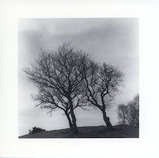
While making a print earlier my first test strip moved during the exposure of the test strip. In looking at it more I decided I liked it. The subject was the three trees from North Wales.  Original print The test strip is here below.  Inspiration! I decided to try this formally as an image. I considered how to shift the image. The shift in the test strip was from flattening the curl in the paper. This has the potential advantage having the two images pivot from the ground. I rejected this though as it seems harder to control and there will be a loss of focus. Still it is worth thinking about as the result may appear more like a shadow which could be useful. I decided on a simple horizontal shift. Since the original print was almost entirely the full horizontal range of the negative I needed to create some space for the shift. I cropped the image in tighter to make room. Since it is a square image I lose some sky but I shifted the crop up to have less ground in the foreground....

Making Notecards in the Darkroom

Image
Introduction During the last few days as I have been making and toning images on Ilford MG Art 300 paper I got the idea that the paper has such a nice weight and feel it could make good note cards. Pursuing this idea I started with the Gradient Birch image I have been using lately. Needless to say I like the image a lot. It is also easy to print as it doesn't require any manipulations like burning or dodging. Since I plan to make a lot of these I didn't want an image that is complex to produce. Blog Post Cover Image Card Layout: Deciding on a Size I started out with the 12 inch x 16 inch dimensions of the paper I have. A reasonable card size is 4x6 inches folded from 4x8 inch paper. I can get 4 of these from a 12x16 sheet. At £3 a sheet it is less that £1 cost for each card. I then have to figure the image size and aspect ratio and borders. I doodled on paper starting with the 3:4 ratio of the 4.5 x 6 cm negative. Not surprisingly 3x4 inches works nicely with fat borders. These...

Sepia and Sun Toning in Practice

Image
I set out to apply some of the sepia toning work I did to a good print rather than the test prints I was experimenting with.  Original Print Gradient Birch I started with Wood Walton Gradient Birch. It has some very subtle layers of tones. When I originally printed it I had a lighter and a darker version. I decided to use the darker exposure as most of the time if bleaching is used the image loses some of the original exposure.  I made 3 prints in this fashion with this exposure with 3 minutes Eco 4812 development, stop, and fix. I then washed for 5 minutes, hypo clear for 5 minutes and wash again for 5 minutes. A fourth print I doubled the exposure. This one was part of a my plan to try the sunlight toning I developed in a previous post. I speculated these would benefit from extra exposure due to the deep bleaching.  So I settled on the following set of prints to try.  1) Simple Sepia: Normal exposure. Tone Sepia only nudge it warmer at 2:00 minutes in 1+100 Sepia...

Bleaching + Sunlight = Toning?

Image
Introduction During my prior post on Sepia toning I had a thought about bleaching somewhat unrelated but inspired by  the moment.  I was inspired as I was taking photos of the prints in the bright sun after bleaching and I was aware that the ultraviolet from the sun was probably 'printing out' the image much as a lumen print does. (Ultraviolet light is energetic enough to leave metallic silver that makes a visible image.)  Naturally as this was a bleached image it would only print out the silver in areas where it was left in the latent image. The non-image silver had been removed by the fixing stage.  Original Image (note lack of density in upper and upper right of image) So I took another test print with good densities and endeavored to bleach it back as far as possible. This I did with 7 minutes of potassium ferrocyanide 1+9 solution. What remained of the image...

Sepia (Sulfur/Sulphur) Toning Experiments (or what to do with old test prints)

Image
I decided to break out the Moersch MT 4 Sepia toning solution and give it a try. I am usually not a fan of warm tone prints or sepia toned prints. It is a just a matter of personal taste but it is always worth exploring things outside of your own creative sphere. (This is the smelly form using sulfur (or sulphur if your are from the UK.) Moersch MT 4 Sepia Toner I read through the documents on the Moersh Photochemie website .  The sulfur/sepia toning documents are here (NSFW images) . Like most of Wolfgang's documents I find them poetically confusing. Whether this is because English is a second language or just a style I find it frustrating and entrancing at the same time.  The article is really part of an overall discussion on toning and bleaching with the linked section focused on sulfur toning.  Here are some things I gathered to aid in understa...