Posts

Showing posts from March, 2021

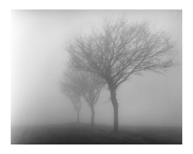
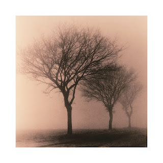
Four + One: Different Prints (including hand colored)

Image
This print I call 4+1 I made last year in Holme Fen. It has stuck with me as a nice image and I have included it in my Three Wood Lands photobook . The first time I printed it I took a test print and hand colored it . It looked alright but I cropped out the flaws in photoshop so it needed to be done again at some point.  4+1 Blog Post Cover Image (Cold Tone) I had read somewhere that for hand coloring prints it is preferable to use a warm tone image. I set about combining the need to make a better hand colored version with an experiment with sepia toning and hand coloring. I made 4 different prints. Normally I make these prints for hand coloring a half or full stop lighter so the color has a chance to shine.  For all the images I used Ilford MG Art 300 paper as it has a cotton rag base and the texture is much like watercolor paper. This paper is my favorite for hand coloring with pencils as the rough texture takes the color easily. I developed them all with Moersch Eco 4812 which has a

Mathematical Trees Study 2: Lith vs Blue Toning (less acid?)

Image
I ran another Iron Blue toning experiment on my earlier lith prints. I normally mix this as 5+5+10+5 from the Moersch MT7 iron blue toning kit I use. The nomenclature means iron + bleach+stabilizer+acid. I mix 500ml batches for these 8x10 prints so the numbers are milliliters plus enough water to make 500ml.  The results in the past have been good but I wanted to keep the highlights clearer and in the case of the lith prints retain some of the original tone of the lith developer. The earlier versions had the lith tone almost completely subsumed by the blue tone.  Reading the documentation indicated the the strength of the acid could increase the rate of toning but also tone the highlights more. so I reasoned I should try less acid. It would at least give a little more time to decide when to pull the print. I mixed it as 5+5+10+2.  The result did improve on some of my objectives. The change of color was slower and proceeded more slowly through the highlights. I managed to get a better m

Mathematical Trees Study 2: Lith vs Conventional Print

Image
I printed a couple of versions of this photo from the previous post  using conventional multi-grade paper and developer. My aim was two-fold. 1) produce a conventional print, 2) provide a means of showing the increased contrast that lith printing can provide.  In previous versions of this series those conventional prints were printed to attempt to hold the fog quite white. This resulted in very faint prints with a unique aesthetic. In these I wanted to mimic the same level of tone as the lith prints I made. I made two prints as a result. The first a mix of hard and soft filtration to control for maximum contrast and to bring the fog tone to a comparable level as the lith versions. Ilford FB Classic #5 38 sec # 00 11 sec with 11 sec burn left to right  The second I made with the hard filter only. This is to show the maximum contrast.  Ilford FB Classic #5 54 sec burn left to right Here is a comparison of the first image above and a Oriental Seagull lith print from the previous blog post

Mathematical Trees Study 2: More time in the Lith Rabbit Hole!

Image
After my first images in this series resulted in extended time re-connecting with Lith development I finally moved on to image 2 of the Mathematical Trees series. One comment by Sergio on this blog mentioned the idea of formalism that I think is correct. I am going through a deliberate process to view these images in different ways. While formal I am also allowing serendipity to play a role where mistakes and impulses can contribute.  Blog post cover photo This second image was the same trio of trees but taken from the left side. This vantage meant the sun was behind me and the gradient of light across the image is not so apparent. This could make printing easier. I started with an initial square crop but found that cramped and liked the rectangular crop more where the eye is allowed to follow the line the trees make.  Again I am working with lith developer. I started out with the Oriental Seagull paper I used in the last set. I have almost 300 sheets of it so I can use it to get the b

Printing Mathematical Trees Study: Lith Developer

Image
This is the second in the series exploring the images from a study I did on some trees in the Cambridgeshire countryside. This post contains a lot of detail notes of the process a more readable summary of the  project is here . Blog Post Cover Image This time I am looking to lith developer to see if I can improve contrast. I have a love/hate relationship with lith as I have found it very difficult to get consistent results. This is often what makes it attractive to others however. I also don't like the long development times and in the past resorted to  heating the developer .  Never-the-less I embarked on this branch of the journey of these prints with such low contrast.  I found the results so good at one point that I kept venturing deeper into lith territory. I found the rewards of  persistence and research.  Lith Prints I mixed up a batch of Fotospeed Lith developer 15ml+485ml water for each part A and part B per instructions.  I started out with the Ilford FB Classic paper and

Printing Mathematical Trees Study: Conventional Development

Image
This is the first post on a series of attempts to print some of the images I made in the Mathematical Trees Study blog post . This post contains a lot of detail notes of the process a more readable summary of the project is here . My objective is to explore these images for their potential and also to stretch my darkroom skills. These images in heavy fog are haunting but also a real problem to print. There is such a narrow range of tone there is not really the idea of shadow just different highlights. This tends to mean that want appears an scene evenly lit by the diffuse light is in fact a gradient brightest closest to the sun moving subtly darker away. The negative scan below is not my objective, it just reveals the subtle range of tones. I want to present the fog as white (not gray) and yet have the trees apparent.  Scanned Negative My first attempt was to try and tease out some contrast on Ilford MG Art 300 paper. This paper is based on a cotton rag watercolor paper so has a strong