Film from Digital Prints: Fomatone Warmtone Paper
Another print in this series of digital images made into negatives for conventional silver gelatin prints. You can find earlier incarnations here...
 |
| Blog Post Image |
This time I decided to experiment with a warmtone paper. The genesis of this was that I noted, and Andrew Sanderson master printer prints exclusively on Ilford Warmtone paper. I have a bias towards neutral tone papers and developer, and I typically use Ilford MGFB Classic with a very white baryta paper base or Ilford Art 300 paper with a cotton rage paper that is slightly warm in tone. I use Moersch ECO 4812 developer which is a neutral developer on these papers.
I do not know the reasons for Andrew Sandersons choice but there are some printers that prefer a slightly warm tone and will add a barely noticeable sepia tone to a finished print. It is also possible that it provides more opportunity for toning generally. So I thought why not?
I do not have a warmtone developer however so there is a limit at this point to the experiment. Initially I tried to get some Ilford Warmtone FB paper but there was no stock at my usual vendors and I settled on Fomatone MG Classic 132 FB Semi-Matt paper in 9.5" x 12" size.
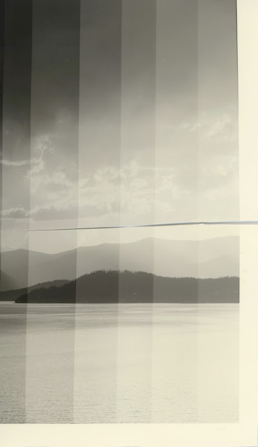
I set up the enlarger and the easel for a print with 1/2" borders (8.5" x 11"). I measured the image on the baseboard and knowing warmtone paper is slower I moved the Ev in the shadows 2 stops from Ev 3.2 to Ev 5.2. This put me at f8 for my 75 watt bulb. Below are the first test strips.
 |
| Scan025 hard test f8 |
 |
| Scan025 soft test f8 |
The neagtive is fairly low contrast. The developer left a slightly green cast in some light. The borders are distinctly warm in tone, different from the baryta paper I am used to.
I settled on 8 seconds of the softer filter and ran another test strip with this as the base exposure and new series of #5 filter exposures. I could then assess the overall impact on the shadows.
I tried half of my second test strip with a different developer to see if there was a difference in tone. The top half is in Ilford Universal PQ which is some developer I have had for a while and has given a slightly warm tone on other papers. The bottom half is deveoped in ECO 4812. I see no difference in tone or density. The Universal PQ develops in about a minute and a half, but I let both develop for the full length of the ECO 4812 of 3 minutes.
 |
| Scan024 test f8 #00 8 sec #5 test (8-64 seconds 1/2 stop intervals) Universal PQ Developer Top ECO 4812 Developer Bottom |
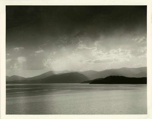
From this I surmised 45 seconds on the hard filter and 8 seconds on the soft filter. The strategy was to use the soft filter to reinforce the midtones and not rely solely on the hard filter. The soft filter should also build deeper blacks and at this timing does not impact the white areas.
 |
| Scan026_stitchf8 #5 45 sec #00 8 sec |
This is a great first print result. Overall, I like it. I need, however, to explore a little. It might improve it to darken the sky at the top so long as I can keep some detail. My next print adds a quarter stop burn to the upper portion with 9 seconds more exposure under the hard filter.
 |
| Scan022_stitch f8 #5 45 sec #5 burn top 9 sec #00 8 sec |
The burn really helps I think, but it may depend on the lighting of where it is displayed. I also tried a version with 4 seconds of the soft filter to boost the highlights. The impact was in the mid-tones and this filter could be used to adjust the mid-tone layers lighter and darker. Frankly, I like the tones where they are.
 |
| Scan028_stitch f8 #5 45 sec #5 burn top 9 sec #00 4 sec |
The next step will be to try some toning.
Comments