Impressionism on Film?
A private theory of mine is that the Impressionist artists got some of their ideas from the emerging technology of photography. My insight, if one could call it that, was spotting dust off of black and white negatives of my brother's to be included in a book I was making of his work. When you work that closely on an image you can see how the image is built up out of different shaped grains of silver of differing density and size. A photo that conveys a clear and focused image of a familiar object is composed of pieces that are nowhere nearly so sharp or definite when examined closely.
To me this is similar to what the impressionist did with a paint brush. Not interested in marking shapes and shades in sharp well drafted lines they are made with strokes, brushes, or points of color and shade. Anyway, that is my theory, I have no other way to defend it.
This led me to think that I could make images that were intentionally very grainy. That led me to think I should try landscape photography with my smallest camera. My biggest camera is a 4x5 large format. I thought I should try my Minolta MG 16 camera.
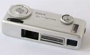
The Minolta takes 20 photos on 16mm movie film. Each photo is 14x10mm, very tiny. The camera has a 28mm f2.8 lens. There is a built-in meter as well. It is impressive for its size. Actually, it is quite fun to use.
 |
| The Scale of the Endeavor Negative in yellow Enlarged Negative in gray Final print size in blue |
When I first got the camera, I bought 100ft of Kodak 7222 Double X black and white movie film. I have a few empty film cartridges and load the film myself. Thís involves coiling 18 1/2 inches into the small cartridge. Doing this the last time in a dark bag I found that it is easy to scratch the emulsion. It is important to wind the film to the proper tightness without pulling the film to make the roll tighter. As a result, though I took a full roll of 20 images few were useable. I also found the guidelines in the viewfinder are quite conservative so I could stand closer to the subject.
I ended up with this one test image of what I called the Origin Trees which I have printed in other incarnations before. Molly and I went back out, and she had a great deal of fun running about the fields as I tried to get photos of trees. These seemed like natural subjects for this experiment.
 |
| Source image on 16mm film |
The film is ISO 200/250 so not terribly grainy except of course the negative is quite small. I put the negative in the enlarger and when I cranked it to its greatest height, I could just manage a 6"x4" (150mmx100mm) image. This wasn't going to have the effect I was after. I then decided I needed a bigger negative, so I made a 4x5 version on some ortho lith film.
 |
| Interpositive Examples (4x5) |
From these I picked a couple and then made a negative. Again, I had to be very careful about cleaning dust. The negative I made as a contact print. To make both the positive and negative I found it very useful to use a 4x5 film holder. In the first case I would load the lith film in the film holder and position it under the enlarger. To help with focus and composition I put a sheet of 4x5 white paper in the film holder to make the image easier to see. I also used the corner of the easel to locate the corner of the film holder.
 |
| Final negative examples |
I picked the best of these which I judged to be one with interesting detail in the tree trunks and the hedge band at the base of the trees. The one I picked is still in the enlarger and sits between the two pictured above in terms of density.
Conventional Prints
From here I planned to make some conventional prints and then to try lith printing some examples.
I made hard and soft test prints, and this put me in the range of #00 filter at 8 seconds as I wanted some color to the sky and a little fill for the highlights generally. I then chose #5 at 11 seconds to raise the contrast.
 |
| f45 #0 8 sec #5 11 sec |
 |
| f45 #00 8 sec #5 11 sec burn top #5 11 sec |
 |
| f45 #00 8 sec-#513 sec #5 burn top 13 sec |
Finally, all hard filter. I still get tone in the sky and a grittier appearance.
 |
| f45-#5 13 sec burn top #5 13 sec |
So where am I on this? First of all, I have never been an enthusiastic fan of this gritty style, but I should also push my aesthetic boundaries. The next set of images are my lith versions.
Lith
I made four images on Oriental Seagull grade 2 paper. It liths reliably and I have a lot of it so it is always a good starting point. I made the first two prints forgetting the need to burn the upper half of the image. The consequence was the infectious development started in the hedge and couldn't progress evenly up the tree trunks. I did one for 32 seconds exposure at f32 taking an ISO 100 Ev 3.0 reading in the stubble in the foreground. This one gives the classic higher contrast the lith gives for lower exposure times. It also exhibits the need for burning the upper half.
 |
| Oriental Seagull #2 Lith Print f32 32 sec |
The next is a 64 second exposure. It exhibits more tone in the sky and as a consequence slightly lower contrast.
 |
| Oriental Seagull #2 Lith Print f32 64 sec |
 |
| Oriental Seagull #2 Lith Print f32 64 sec burn top 64 sec |
This looks better and the infectious development proceeded in a more uniform way in the shadow areas.
Up until this point I had pulled the print from the developer once I saw the shadows well-developed but not wanting them to run away in the dark hedge band in the lower third. For the next one I decided to let the development run much longer. I stopped once the hedge area began to close up before it became pure black. Surprisingly, the sky darkened a lot, and the burn area became very apparent. It also revealed a lighter portion on the right edge that could bear with a burn to even it up more.
More importantly is the degree to which the mood has changed, suddenly dark and foreboding.
 |
| Oriental Seagull #2 Lith Print f32 32 sec burn top 32 sec |
Toning
 |
| Oriental Seagull #2 Lith Print f32 64 sec Selenium 1+12 3 minutes Iron blue toning Ammonia Bath Photoshop borders |
 |
| Oriental Seagull #2 Lith Print f32 32 sec Selenium 1+12 3 minutes Iron blue toning Ammonia Bath Photoshop borders |
 |
| Oriental Seagull #2 Lith Print f32 32 sec burn top 32 sec Fish and Chips Bleach Sepia tone Redevelop in old EasyLith |
Comments