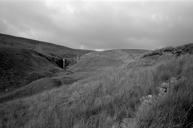
Prints of Force Gill Whernside Yorkshire Dales
This past October my wife and I visited the Yorkshire Dales as outlined in this post. I have finally gotten around to making some prints in the darkroom from this trip. This is Force Gill on Whernside the highest point in Yorkshire. It was taken with my Fuji GSW 690 6x9 medium format rangefinder camera on Ilford FP4+, developed with HC-110 dilution B single shot.
I was a bit lazy however and decided to print it in my downstairs darkroom (I know how luxurious it sounds to have two darkrooms!) which means my Meopta 6x6 enlarger. The Beast upstairs can handle the 6x9 negative but it is a bit limited in that it has no wet-side and I must haul my exposed paper downstairs in a light-tight tube to develop the prints. (See not really luxurious at all!)
So I opted to crop 6x6 out of 6x9 and this changes the image markedly. Below is the original image from the scanned negative. As I noted before in my best of 2018 post, I liked this wide angle shot as it makes the waterfall fit into a much larger landscape context. The impulse with these kinds of images is to make the waterfall the entire subject. I like this as it conveys the grandness of the environs, they eye led to one point of interest but not dominated by it. I reckon I will need to print this version to see it in large print glory and confirm (or deny) my feelings.
 |
| Original Negative |
The first print is essentially the left two thirds of the negative. I was not straightforward to print however. After I used test strips and a couple of straight prints to dial in the exposure I realized with the left slope north facing and thus in shadow and the right slopes in sun I would need to dodge the left slopes to balance the exposure. I also had to balance the exposure to darken the sky. Below is a rough diagram of the area I dodged.
 |
| Dodged area outlined in yellow |
 |
| First finished print |
The next I cropped in as tightly as I could and my aim was to remove the sky altogether. A bunch of artificial constraints that certainly makes the print easier to achieve. (I got the right exposure in the second print.) Does it work? It is reasonably sharp and not terribly grainy. I estimate the negative area at about 30x40mm somewhat larger than a 35mm negative (24x36mm) and the FP4+ contributes to less grain. Is it a good composition? Is it pleasing? You decide.

Comments