The Glory of Our West: Part 1
A couple of years ago on one of my visits to see my dad in the the USA my wife and I stopped by our favorite bookstore in Bonners Ferry Idaho, Bonners Books. We love browsing their well curated selection of books in a quiet and friendly atmosphere. I stumbled upon this slender volume called The Glory of Our West. It was filled with really nice iconic images of the western US and a short essay for each image. (There are in about 50 images so I will break this into a number of postings.)
I did a little research, published in 1952 it was made to encourage motor trips to the west by Standard Oil of California for rather obvious commercial reasons. They combined photographs from the foremost landscape photographers of the time and writings by various famous writers in the west at the time. There were earlier versions as well apparently and other editions. The photographers and writers were mostly regional. The whole work while clearly commercial in intent was executed with some artistic flair. The choice of photographers and writers and the lack of advertising copy makes it intriguing.
The photos are reproduced as lithogravure prints in full color in a spiral bound book. The colors are of a wonderfully muted tone presumably due to the inks used and the lithogravure print process. In the back are the details of how the photos were taken; typically on large format 5x7 and 4x5 cameras mostly using an early version Kodachrome which was very slow along with some early Ektachrome.
These had to be the early days of color landscape photography. Amongst the photographers is Ansel Adams who we don't associate with color landscape work but we also know was pragmatic about accepting commercial work.
I have scanned the photos to present here and attempted to adjust them to look as they do on paper. The paper has yellowed with age and so I have reset the white balance assuming they were presented originally on pure white paper.
The scanner resolution took some playing with as there is a dot pattern (rosette) associated with the lithogravure printing process which creates interference patterns with the scanner resolution. At 800 DPI there are noticeable interference patterns while 1600 DPI reveals the lithogravure screen pattern consistently so is truer to the original print. These appear to be screen printed in 4 colors CMYK (Cyan, Magenta, Yellow and Black respectively). The halftone screens in each color are rotated with respect to each other to reduce the moire pattern that would otherwise result. This creates the rosette pattern that can be seen when magnified. (A good explanation of the reason for the rosette pattern here. ). It is interesting to note that printing in the analog age was in fact digital and rather than a Bayer pattern on digital cameras sensors there is the rosette of lithogravure printing.
It may be appropriate to examine different filters to smear the screening patterns to restore an analog effect.
In any case here are the photos and with the photographer's notes for your enjoyment. (More technical discussion after the photo section.)


One is forced to reconcile the limitations of technology to reproduce images. For me these images remind me of my grandmother's coffee table book of images from the national parks. Probably printed with similar technology they were grand images but of rather muted colors by today's standards.
At the same time we are reminded that our appreciation of an image is based upon what we have seen before. It is interesting that in today's digital age that people still like a 'film' look though technically it does not cover as much color gamut as modern digital methods might. Digital animated movies, for instance, simulate lens flare though no lenses were used in the production process. All because we are trained to think of these as authentic only when flaws or artefacts are present. Future generations may well lose interest in the film look as a result.
Below is a diagram that illustrates the expansion of color gamut. The CIE diagram goes back to perceptual visual tests made in the 1930s. It has remained mostly the same since then. The overall blob represents the entire visual space with regard to color as perceived by the human eye (on average). The SWOP outline is the extent of modern offset printing. In 1952 this range may have been smaller.
Prophoto RGB covers a much larger space but even this is not available to most digital sensors which barely exceed AdobeRGB. Also none of these can represent all the colors the eye can see. Most photographers today edit and print in the sRGB or Adobe1998 color spaces and so their physical work exists in this compressed color space. These were developed for monitors and printers in the 1990s for the burgeoning desktop publishing and web markets. The early technology pioneers saw the need to standardize so that images that were exchanged would roughly be displayed with the same color.
The second CIE diagram shows reversal film responses (print film has a much larger color gamut very close to Adobe RGB). Adobe RGB is the white triangle, Velvia is the light gray polygon and Ektachrome (no longer available) is the black polygon. Looking back at the SWOP CMYK polygon one can see the limitation of modern printing processes. Indeed photo paper and inkjet does not improve on this a whole lot. I suspect monitors for the most part aren't much better as they only represent 8-bits (or stops) of dynamic range per color while color print film can be in the 10-14-bit (stop) range depending on who you listen to.
So in many ways these can become aesthetic choices we make in the processing of images. Perhaps these older reproductions can lead to a different aesthetic...
I did a little research, published in 1952 it was made to encourage motor trips to the west by Standard Oil of California for rather obvious commercial reasons. They combined photographs from the foremost landscape photographers of the time and writings by various famous writers in the west at the time. There were earlier versions as well apparently and other editions. The photographers and writers were mostly regional. The whole work while clearly commercial in intent was executed with some artistic flair. The choice of photographers and writers and the lack of advertising copy makes it intriguing.
The photos are reproduced as lithogravure prints in full color in a spiral bound book. The colors are of a wonderfully muted tone presumably due to the inks used and the lithogravure print process. In the back are the details of how the photos were taken; typically on large format 5x7 and 4x5 cameras mostly using an early version Kodachrome which was very slow along with some early Ektachrome.
These had to be the early days of color landscape photography. Amongst the photographers is Ansel Adams who we don't associate with color landscape work but we also know was pragmatic about accepting commercial work.
I have scanned the photos to present here and attempted to adjust them to look as they do on paper. The paper has yellowed with age and so I have reset the white balance assuming they were presented originally on pure white paper.
The scanner resolution took some playing with as there is a dot pattern (rosette) associated with the lithogravure printing process which creates interference patterns with the scanner resolution. At 800 DPI there are noticeable interference patterns while 1600 DPI reveals the lithogravure screen pattern consistently so is truer to the original print. These appear to be screen printed in 4 colors CMYK (Cyan, Magenta, Yellow and Black respectively). The halftone screens in each color are rotated with respect to each other to reduce the moire pattern that would otherwise result. This creates the rosette pattern that can be seen when magnified. (A good explanation of the reason for the rosette pattern here. ). It is interesting to note that printing in the analog age was in fact digital and rather than a Bayer pattern on digital cameras sensors there is the rosette of lithogravure printing.
 |
| Rosette Patterns from Lithogravure process |
In any case here are the photos and with the photographer's notes for your enjoyment. (More technical discussion after the photo section.)

Point Lobos
GEORGE E. STONE, San Jose. 5x 7 Eastman view camera; Voightlander Collinear 7-1/4" f:6.3 lens; 85B gelatin filter, unmounted; type B Kodachrome film; 1/25 second at f:8; between 3 and 4 p.m., October; brilliant light through broken clouds.

Glacier National Park
ANSEL ADAMS, San Francisco. 5 x 7 Zeiss Juwel camera with 4 x 5 reducing back; 127 mm. Eastman Ektar lens; Kodachrome film, daylight type; 1/10 second at f:16; Late September. 11pm

Yellowstone National Park
STAN KERSHAW, Cody, Wyoming. 4 x 5 Korona view camera; 6" Zeiss Tessar f :4.5 lens; Kodachrome film, daylight type; 1/20 second at f:10; July, midday, partly cloudy.

Jackson Hole Country
FRED BOND, Los Angeles. 5 x 7 view camera with 4 x 5 reducing back; 9-1/4" Goerz Dagor lens; Cl/8 filter; Kodachrome film, daylight type; 1/2 sec. at f:40; July, 10 a.m.

Mount Rushmore
CHARLES D. DOWNEY, Scottsbluff, Nebraska. 5 x 7 view camera; 12" convertible anastigmat lens; Kodachrome film, daylight type; I second at f:45; cloudy-bright day; 9:30 a.m.

Rocky Mountain National Park
FRED BOND, Los Angeles. 5x7 view camera with 4x5 reducing back; 5" Ektar lens; CYs filter; Kodachrome film, daylight type; 1/5 second at f:22; July, 11 a.m.

Pikes Peak from Garden of the Gods
MIKE ROBERTS, Berkeley. 8 x 10 view camera; 12" lens; Kodachrome film, daylight type; 1/2 second at f:32; 9 a.m., bright sunshine.

Colorado National Monument
WILLIAM EYMANN, Palo Alto, California. 4x5 Speed Graphic camera; B. & L. Tessar lens f :4.5; CC13 filter; Kodachrome film, daylight type; 1/5 second at f:28; 11 a.m., early June.

Snowmass Lake
MIKE ROBERTS, Berkeley. 5 x 7 Graflex camera; 6-1/4" lens; Kodachrome film, daylight type; 1/5 second, f:16; high noon, October.
MIKE ROBERTS, Berkeley. 5 x 7 Graflex camera; 6-1/4" lens; Kodachrome film, daylight type; 1/5 second, f:16; high noon, October.

Mesa Verde National Park
ANSEL ADAMS, San Francisco. 5 x 7 Zeiss Juwel camera; 14.5 cm. Zeiss Protar lens; Kodachrome daylight type film; 1/10 second at f:ll; early afternoon, late fall.

The Alamo, San Antonio
MIKE ROBERTS, Berkeley. 5 x 7 Graflex camera; 6-1/4" lens; type B Kodachrome film; conversion filter; 1/5 second at f:ll; 9 a.m., September.

Big Bend National Park
ANSEL ADAMS, San Francisco. 8 x 10 Ansco Commercial view camera; Cooke triple convertible lens; CC13 filter; Ektachrome film; 3 seconds at f:45; fairly bright, early spring morning.

Carlsbad Caverns National Park
ANSEL ADAMS, San Francisco. 5 x 7 Zeiss Juwel camera; Zeiss Protar lens; CC15 filter; type B Kodachrome film; open flash exposure. Three flashes were used, One operated by "photo-eye" control.

White Sands
ANSEL ADAMS, San Francisco. 5 x 7 Zeiss Juwel camera; 8-1/4" Ektar lens; no filter; Kodachrome film, daylight type; 1/5 second at f:32; late afternoon light, late in February.

San Antonio de Isleta
FERENZ FEDOR, Albuquerque. Ernemann reflex camera; 7" f:4.5 Tessar lens; Kodachrome film, daylight type; 1/10 second at f:ll; October, 2 p.m.

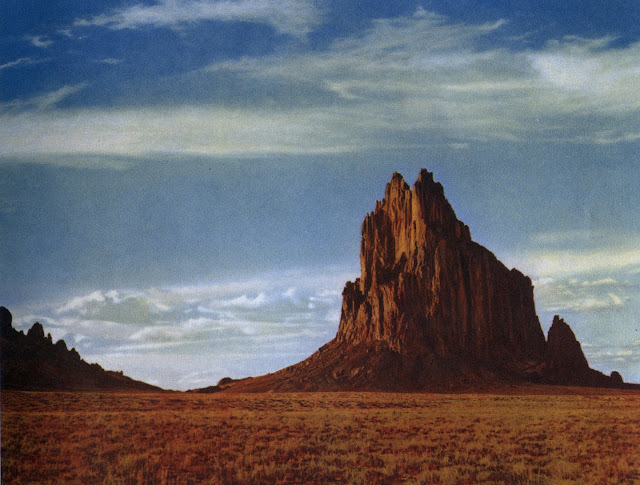
Shiprock
WINTER PRATHER, Denver. 5 x 7 Graflex camera, series B; Wollensak Velostigmat lens, series 11; f :4.5; Harrison filter (color temperature at time was 7100-8000K) ; Kodachrome film, daylight type; 1/30 second at f :11; late afternoon sun, mid-September.

Walpi Indian Village
ANSEL ADAMS, San Francisco. 5 x 7 Zeiss Juwel camera; 14" lens; Kodachrome film, daylight type; no filters; sunrise in October.

Oak Creek Canyon
ESTHER HENDERSON, Tucson. 5 x 7 Eastman view camera; 81/2" Goerz Dagor lens; Kodachrome film; 1/5 second at f:20; afternoon, early August.

Saguaro Cactus and Superstition Mountain
ESTHER HENDERSON, Tucson. 5 x7 Eastman view camera; 8-1/4" Goerz Dagor lens; Kodachrome film; 1 second at f:29; early morning, late September.
Thoughts on Printing and Color Space
I was struck by the subtle tones of the printing process and contrast them to current crop of photographers with highly blown saturated colors that are the de rigueur of modern landscape photography. This all seems to have started with Fuji Velvia but was certainly present in earlier Kodachrome compared with its predecessors. I have always favored saturation myself so this is not some kind of snobby rant merely a reflection.One is forced to reconcile the limitations of technology to reproduce images. For me these images remind me of my grandmother's coffee table book of images from the national parks. Probably printed with similar technology they were grand images but of rather muted colors by today's standards.
At the same time we are reminded that our appreciation of an image is based upon what we have seen before. It is interesting that in today's digital age that people still like a 'film' look though technically it does not cover as much color gamut as modern digital methods might. Digital animated movies, for instance, simulate lens flare though no lenses were used in the production process. All because we are trained to think of these as authentic only when flaws or artefacts are present. Future generations may well lose interest in the film look as a result.
Below is a diagram that illustrates the expansion of color gamut. The CIE diagram goes back to perceptual visual tests made in the 1930s. It has remained mostly the same since then. The overall blob represents the entire visual space with regard to color as perceived by the human eye (on average). The SWOP outline is the extent of modern offset printing. In 1952 this range may have been smaller.
Prophoto RGB covers a much larger space but even this is not available to most digital sensors which barely exceed AdobeRGB. Also none of these can represent all the colors the eye can see. Most photographers today edit and print in the sRGB or Adobe1998 color spaces and so their physical work exists in this compressed color space. These were developed for monitors and printers in the 1990s for the burgeoning desktop publishing and web markets. The early technology pioneers saw the need to standardize so that images that were exchanged would roughly be displayed with the same color.
 |
| Color Space Example 1 |
 |
| Film Color Space |
So in many ways these can become aesthetic choices we make in the processing of images. Perhaps these older reproductions can lead to a different aesthetic...
Comments