Posts

Showing posts from April, 2022

Aversley Wood Lith: Creative Enhancements

Image
I went looking for another image in the back catalog to try some of my recent lith work on. The one I settled on was one taken on a foggy day (Fog seems to fit these techniques well where contrast manipulation is difficult with multi-grade papers.)  This one I never successfully printed. Taken across a field from the edge of the woods, the fog was so thick as to almost render the trees invisible from that distance. When I was there the edge of existence seemed compelling. In a print it amounts to a lot of white paper except for the foreground.  Scan of negative The scan above has the contrast tweaked quite a bit in curves. After composing and focusing (a grain focuser comes in real handy here) I started by setting the aperture according to my Ev (@ISO 100) of 3 rule as measured in the fog. This left the trees around Ev 4 and the field in the foreground around Ev 5. This gave me f8 for 32 seconds though most I printed at f5.6 at 16 seconds which is the same exposure but just a ...

Change

Image
There are a couple of different narratives here but let's see how this unfolds... This was also written over a month ago and I have finally gotten around to posting it. Firstly, I returned to Holme Fen this week after a series of big storms passed through the UK. Here in the east of England we did not suffer much damage compared to some areas. Never-the-less I was able to see a number of trees down.  On a related item we had some friends visit and one commented that I must like trees as she was looking at my 'gallery' in our downstairs bathroom (toilet in the UK as there is no bath there). I hadn't really noticed my subject was trees as I was thinking woodlands, but she was not wrong. I reflected later that this was because that was all there is to see in Cambridgeshire landscape-wise. Not entirely true but if you have been here, you will get my point.  Part of the 'Gallery' While Mollie and I were walking it was apparent how much change had been wrought by the ...

Wye Forest no1 Print: Lith Versions

Image
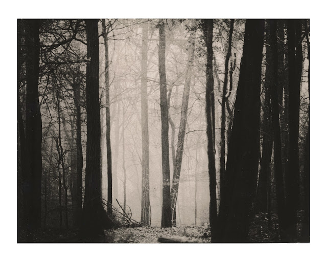
This is another print from the visit to the Wye valley on the English-Welsh border. I first printed this as a conventional print on Ilford RC paper back in 2021. Through the vagaries of Flickr it garnered the most views and second most 'likes' of anything I have posted. (I don't chase likes, views, or explores on Flickr.) I don't know why but it perhaps has to do with not seeming too digital though I also think the dark mood was part of the appeal. This and other similar prints' success have encouraged me to explore the darkness more.  And so, I return to this to see if I can work any lith magic on this image. The original print took some wrestling to get it into the final form. I had to suppress the brightness especially in the upper part of the image in order to achieve the vision of peering into a secret in the deep forest. This turned out to be simpler with lith. I started with a simple straight exposure. I metered the light part of the scene in the center and...

Framing Fohar and Small Prints: Updated with Final Results

Image
Now that I have completed a session of printing comes the time to select images and decide on framing. I have what I guess one would call a trademark format for framing and as a result I found myself out in the garage making some frames. I have a simpler stripped back framing system I use for many prints. No glazing, wooden frames that are blackened with the Japanese technique of yakisugi .  This time I am enjoying smaller prints made on 5x7" (13x18cm) Fohar Bulgarian paper. This leaves a question about framing and proportions. I started out with a simple 5x7 frame but found it was difficult with the narrow 1/4" borders, the deep brown of the print blending too much with the frame.  Mock-up of 5x7 Frame So, I made a new frame that allowed for a wide mount (matte) frame. I have mocked this up below with a paper version of the mount to see if I liked it. I have an order of properly cut mount board to fit in the frames. The beauty of these frames is the rebate for fitting the ...

Revisiting Wye Valley Forest: Part IV Making Small Improvements

Image
I decided to try and make some small improvements based on my project print in the previous post in this series. I had a second lith print of the same type as before. The lith development proceeded slightly further on this one making it slightly darker.  Source lith print This one I applied selenium toner on the forest floor though this time with a swab of cotton rather than the riskier soaking. The 1+3 concentration means it does not take much or long for the toner to work.  I then sepia toned the darker left and right sides about 3 minutes before giving an overall sepia tone for about a minute. The resulted in warmer tones on the sides and a neutral tone in the center.  Selenium and sepia toned version This sets the stage for iron toning.  Added Iron Toner Here is the iron toned version. The sepia toned sides still retain their warmth this time. Not too interesting. I am hoping ammonia fogging will spruce it up a bit.  Ammonia fuming This helped moderate the c...

Revisiting Wye Valley Forest: Part III Final Toning

Image
Increasingly I find that lith printing is not an end to itself but a component of creating the final image. These images I have created lately starting with lith printing I think of as being archetypal or perhaps liminal images, if I understand the terms. I plan to discuss these emergent ideas in a later post. I am gaining a better understanding of the process of lith printing and toning and can now direct the activity a little more. I would not think of mastery as it seems to be an unachievable objective and probably would destroy the process if it were achieved. For to master a process steeped in randomness or serendipity would be to thwart the power of the process to create what wasn't imagined before. From my earlier post in this series, I chose a few images to work with. I wanted to use one from the Oriental Seagull paper and one from the Fohar Raster paper. I would tone them differently in different areas.  I wanted to try the sepia toning o...