Posts

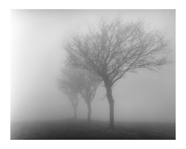
Print Journey Part II-Foggy Path in Aversley Wood

Image
For the next phase I used my #5 filter test print as a jumping off point. As I said I was intrigued by the darker images represented by the 64 and 45 second exposures.  #5 test strip bottom to top, 16, 22, 32, 45, 64 seconds I started by making straight 64 and 45 second exposure prints in the #5 filter to judge the overall tonality.  #5 64 seconds #5 45 seconds These straight prints I find informative. The challenge with the #5 filter is that the transfer curve of exposure vs density is much steeper than the #00 filter. This means that on a very short range of exposures you can go from white to quite dark. In Part I the original test strip went from white to quite dark on the #5 filter in about 4 intervals (each is 1/2 stop)  or 2 stops while the #00 filter achieves the same range in 6 intervals or 3 stops.  In a low contrast negative this means it can be a challenge to see where the transitions between highlight and shadows are. In a normal or high contrast negative...

Print Journey Part I-Foggy Path in Aversley Wood

Image
A couple of months ago I made it out on one of the last foggy days this winter. I chose Aversley Wood as it is reasonably close and I had been there only a couple of times before. It sits above Sawtry near where the monastery that gave Monk's Wood its name was located. It was a good day out. I got a couple of good images. I was out with my Mamiya 645 and shot mostly 150mm with and without 2x teleconverter and my 80mm lens. I shot Ilford FP4+ at ASA 80 developed in a HC110 dilution B at -20% of massive dev chart development time. I also shot some Fuji Pro 400H color film which is on its way to the lab. The delay was because at 15 images to a roll I didn't get through all the film rolls on that one day. I took the black and white film into the darkroom to print a couple of the better images. What did I learn?  Virtually Every Image Can be Printed in Multiple Ways This has been a recent theme ( see here... ) and has become an ingrained truth for me. This is especially true of blac...

Yakisugi Frame

Image
If you have been paying attention to woodworking and building topics recently you will know that a Japanese wood preservation technique called Yakisugi  (sometimes misnamed Shou Sugi Ban based on a mispronunciation apparently) has become popular. The technique involves burning the surface of the wood which leaves it charred. Technically it is applied to Japanese cedar but can be applied to other woods. The burning has a couple key benefits in terms of  wood preservation. Burning removes nutrients like sugars and cellulose from the wood surface. The charred wood is also water water resistant. If you have hiked in an area where a forest fire had burned you may have noted how the charred wood surfaces retain their integrity. The technique is all over YouTube on woodworking channels as everyone is always scrambling for new content topics so a quick search will find innumerable sources of ideas.   I came upon this in a upcycling TV show where an oak desk had the tech...

A Print Cabinet

Image
I haven’t been too active photography-wise this past month. I had a long session in the darkroom in March but this ran its course and as I have learned I need to move to other activities to refresh the creative urges. As usual for me the genesis of my next project was complex, Last year I built a set of shelves I called my cascade shelves . The first Covid lockdown was in effect and I ordered some plywood for the project. It had to be delivered as the stores were closed. Delivery costs a lot so I bought a bunch of extra finish plywood thinking I would find a use for it and spread out the delivery charge.  Well I hate the plywood. The veneer is thin and brittle and makes an unforgiving material. So a bunch hung out in my garage until last September. Around that time I started ruminating on another woodworking project. I also really struggle with what to do with my prints when they are not framed and hung on the wall. They often sit in random piles and this lead me to think about a p...

Four + One: Different Prints (including hand colored)

Image
This print I call 4+1 I made last year in Holme Fen. It has stuck with me as a nice image and I have included it in my Three Wood Lands photobook . The first time I printed it I took a test print and hand colored it . It looked alright but I cropped out the flaws in photoshop so it needed to be done again at some point.  4+1 Blog Post Cover Image (Cold Tone) I had read somewhere that for hand coloring prints it is preferable to use a warm tone image. I set about combining the need to make a better hand colored version with an experiment with sepia toning and hand coloring. I made 4 different prints. Normally I make these prints for hand coloring a half or full stop lighter so the color has a chance to shine.  For all the images I used Ilford MG Art 300 paper as it has a cotton rag base and the texture is much like watercolor paper. This paper is my favorite for hand coloring with pencils as the rough texture takes the color easily. I developed them all with Moersch Eco 4812 wh...

Mathematical Trees Study 2: Lith vs Blue Toning (less acid?)

Image
I ran another Iron Blue toning experiment on my earlier lith prints. I normally mix this as 5+5+10+5 from the Moersch MT7 iron blue toning kit I use. The nomenclature means iron + bleach+stabilizer+acid. I mix 500ml batches for these 8x10 prints so the numbers are milliliters plus enough water to make 500ml.  The results in the past have been good but I wanted to keep the highlights clearer and in the case of the lith prints retain some of the original tone of the lith developer. The earlier versions had the lith tone almost completely subsumed by the blue tone.  Reading the documentation indicated the the strength of the acid could increase the rate of toning but also tone the highlights more. so I reasoned I should try less acid. It would at least give a little more time to decide when to pull the print. I mixed it as 5+5+10+2.  The result did improve on some of my objectives. The change of color was slower and proceeded more slowly through the highlights. I manage...

Mathematical Trees Study 2: Lith vs Conventional Print

Image
I printed a couple of versions of this photo from the previous post  using conventional multi-grade paper and developer. My aim was two-fold. 1) produce a conventional print, 2) provide a means of showing the increased contrast that lith printing can provide.  In previous versions of this series those conventional prints were printed to attempt to hold the fog quite white. This resulted in very faint prints with a unique aesthetic. In these I wanted to mimic the same level of tone as the lith prints I made. I made two prints as a result. The first a mix of hard and soft filtration to control for maximum contrast and to bring the fog tone to a comparable level as the lith versions. Ilford FB Classic #5 38 sec # 00 11 sec with 11 sec burn left to right  The second I made with the hard filter only. This is to show the maximum contrast.  Ilford FB Classic #5 54 sec burn left to right Here is a comparison of the first image above and a Oriental Seagull lith print from the...