As I started to write my post on Chromogenic film I realized I was digging
deeper into the whole subject of printing C41 negatives and the reason why
Chromogenic black and white film exists. It just so happens I had finished a
couple of rolls of film in my Mamiya 645 Pro.
These rolls violated one of my rules of mixing color and black and white
shooting in the same session. The great thing was I had some photos of the
same subject taken back-to-back on both black and white film (Ilford HP5+) and
color negative (Kodak Portra 400).

|
|
Here is the color version.
|
When I first got into film photography (over 10 years ago!) I preferred
reversal (slide film) over color negative film. I had struggled to get good
colors with scanned negative film. Eventually I learned enough to know how to
get good color correction on color negative scans. After I came back to color
negative film I thought an added benefit of C41 negatives would be to be able
to make black and white prints in the dark room without the need for
internegatives. Now I can try this out.
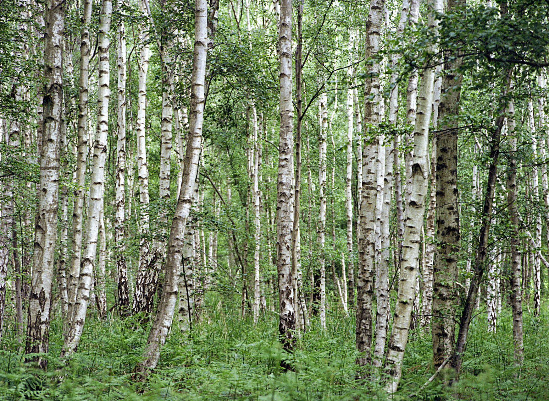
I started out with some birch trees I shot at Holme Fen. The only difference
between the two is the film and a slightly different composition because they
were handheld shots. I printed these all on 8x10 Kentmere VC Select which is
an economy multi-grade RC paper made by Ilford.
First came test strips. Here one can begin to see the differences. I made a
soft filter (#00) and hard filter (#5) strip for each negative. The black and
white film was at f16 while the C41 (Portra 400) was at f8 which reflects the
attenuation due to the orange mask of the color film. From bottom to top the
exposures are 8, 11, 16, 22, 32, 45, 64 seconds. The hard filter shows more
contrast with the Ilford black and white film.

|
Test Strips
(C41 Soft, C41 Hard, HP5+ Soft, HP5+ Hard)
|
Next I printed the HP5+ film getting very close to what I wanted with #5 32
seconds, and #00 11 seconds.

|
| Ilford HP5+ |
Next I made a series of prints on the Portra 400 negative as I strove to make
a print as close as possible to the one above. This is not good it is dark and
lacks contrast.

|
|
Porta 400 #5 45 seconds #00 11 seconds.
|
This next one was much lighter with 1/2 stop less on each filter.

|
|
Porta 400 #5 32 seconds #00 8 seconds
|
Still the blacks want punching up so the next one I upped the hard
filter 1/4 stop.

|
|
Porta 400 #5 38 seconds #00 8 seconds
|
This is close and actually not a terrible print. Below I make a side-by-side
comparison with the HP5+ negative and the better contrast control is
evident. It is easier to get a strong black and preserve the white bark of
the trees with the HP5+ black and white negative.

|
|
Ilford HP5+ (left) vs Portra 400 (right)
|
The natural question is why not throw out the soft filter altogether to get
more contrast. So here it is 4 versions of the Portra 400 mage with no soft
filter and increasing hard filter by 1/2 stop.

|
No Soft Filter Portra 400
(Clockwise from upper left: #5 38
seconds, 45 seconds, 54 seconds, 64 seconds)
|
Here there is nothing that is quite the same as the HP5+ print; the lower
right corner is perhaps closest but the blacks are not as black so if high
contrast is what you are after you are going to be unhappy. The highest
exposure on the lower left has comparable blacks are the expense of the
muddy highlights. We can see this in their respective histograms...

|
Histogram Comparisons
(upper four same position as Portra 400
prints above, bottom is HP5+ print)
|
In all print scans the only adjustment I did was set the white point from the
lower right corner of print border. I did not adjust the black point or expand
the range. The spike on the right (white) is the included border.
Increasing the exposure gets closer to true black but the distribution of
tones is more bunched to the black end of the scale so all the tones are
dragged up. The bottom histogram of the HP5+ print shows how the tones are
more distributed across the range. Remember also that I left in 11 seconds
of the soft filter on this print so there is more room for higher
contrast.
Why the Difference?
Next I try and figure out why the results are poorer with the C41
negative. First we should review the way multi-grade paper works.
Basically the emulsion consists of multiple layers with sensitivity to
blue and green light. All layers are sensitive to blue light but when
exposed to only green light some of the emulsion reacts more slowly and
this makes for a transfer curve that is less steep. The curve for blue
light has a steeper curve. By varying the exposure to change the mix of
blue and green light the slope or steepness of the curve can be
varied.
Because the curve relates density in the paper versus relative exposure,
areas of the negative with more light passing through (shadows) gains
density (becomes darker) much more rapidly for blue light compared to
green light.
When we look at the filters in the multi-grade system they range in color
from Magenta (Hard) to Yellow (Soft) not blue to green. The reason for
this is that the paper is blind to red light (hence the reason a red
safelight does not fog the paper). So the filters pass the color red as
well as blue and/or green. Red + Blue = Magenta, Red + Green = Yellow.
This makes the filtered image on the easel easier to see as the eyes get
more light than if the filters were blue or green alone.
If we then look at a scan of the negative we might analyze the problem.
Below is the full color of the negative. The strong orange color is the
mask filter layer. It is the source of most of the problems. Firstly it
adds a layer of attenuation hence the reason I need 2 stops more light to
get a similar exposure compared to the HP5+ negative.
Next I stripped all the red color from the negative because we know the
paper will not react to red light. Now have just blue and green left as an
imitation of what the paper can see. If we look carefully at the leaves we
notice they are almost entirely blue which means they will turn up very
dark.
Next I remove the green color to show only the blue. The first thing we
notice is that the overall blue image is very dark. That may be ok and is
part of why more exposure is required. If this were the only problem then
we could just up the exposure to get the desired density. There is blue
image information so all should be well. (But we know it isn't.)
Finally we look at the green only channel. Green produces the lowest
contrast as it takes longest to build up density on the paper. Again we
can find some green image information so we could manipulate the exposure
through the soft filter and get a desired lower contrast version.
If we look at this through the corresponding histograms we begin to see the
problem. I have shown four histograms below the blue, green, green+blue, and
all color versions.

|
|
Blue, Green, Blue+Green, and Red+Green+Blue Histograms (left to
right)
|
If we look across the blue and green channels we see a relatively little
range of tone represented. This isn't surprising in some sense as the
image does not have many colors. The image is also relatively low contrast
and more so when we constrain the colors available. The histogram on the
right shows the full range for all colors and red brings in the hump on
the right which is a lot of the luminosity on the negative.
Clearly this changes with the colors in an image but the sensitivity is
inverted. For instance printing on paper which is red blind is like taking
a black and white photo with orthochromatic film however because of the
color inversion in C41 film red in the scene will render as cyan on the
negative which will print because cyan is a combination of green and
blue. Conversely the film will appear blind to cyan which will be rendered
as red on the negative and this will not be seen by the paper and thus
will appear white.
Printing on Pan-chromatic Paper
Many people will claim that pan-chromatic paper does not exist anymore.
Kodak made Panalure but the one box I could buy was old and thus badly
fogged. I did discover however that Ilford makes a product called Galerie
RC Digital Silver which is made for machine processing on color digital
enlargers. As such it needs to react to red, green, and blue LEDs or
lasers used in these machines.
If we look at the Kentmere vc Select paper sensitivity curve we see this
response.
We can compare it to the Digital Silver sensitivity...
In both graphs I overlaid the color scale to better visualize the
color range. This extends much further in to the red sensitivity. The
Digital Silver paper is only sold in rolls as it is meant for machine
processing. I did find that Photowarehouse in the US offered cut
sheets in 8x10. I did not have much luck. The first batch was entirely
black and I suspect they cut it under safelights.
They replaced it for free of charge but I had to wait a year for my
next annual trip to the US. The replacement box however has a faint
gray band of fog over the every sheet as far as I can tell. They seem
to be selling this now as their
own panchromatic pinhole paper
cut to sheet film sizes. Still it can be used to understand if this
helps at all. It is a single grade or contrast however so you have to
take what you get...
A couple of stabs at an aperture landed at f8 for a test strip. This
is with no filtration.

|
Panchromatic Paper Test Strip
(f8 8-64 seconds 1/2 stops.
Note gray vertical band near center, a fault on every sheet.)
|
Already you can see there is not much contrast. I pick 22 seconds (4th
from bottom) as reasonably good and make a print. (Recall all these
examples will have a faint vertical band due to handling problems when
the sheets were cut and boxed.)

|
|
Panchromatic Paper Print (f8 22 seconds no filter)
|
What can I say. Low contrast and too muddy for the subject matter. It
might work for some images.

|
|
C41 Multi-grade vs Pan Paper Comparison
|
Next I experimented with further filtration. I don't have an extensive set
of filters however. It was interesting to try the red safelight filter with
this paper.

|
|
Panchromatic paper printed with red safelight filter
|
I tried hard and soft filters as well and the results were not much different
as they both admit red light in addition to blue and green light respectively.
Next I tried to make a green filter by stacking some color printing corrective
filters (+.5 cyan + .4 cyan + .5 yellow + .4 yellow) this resulted in a very
dim test strip by about 2.5 stops. This is not surprising as the color
histogram of the green channel indicates not much light passes in green
only.

|
|
Panchromatic paper printed with green filter
|
If you have made it this far you should probably have something better to
do! There seems to be no way to redeem the panchromatic paper or printing
C41 negatives on black and white paper. If you must then multi-grade paper
gives the most hope of controlling contrast. There are other areas to
explore including higher contrast development techniques such as
VGT developer
from
Moersch Photochemie,
lith printing, and pulling from the developer early before the highlights
get fully developed.
Addendum: Making an Interpositive?
Recently on
Reddit there was a question about making a black and white interpositive as a means of printing a C41 negative on black and white paper. I suggested how this might be done and mentioned that orthochromatic film is easier to work with in the darkroom owing to being safelight compatible. Someone pointed out that the tones would shift if this was the case. For instance greens would look lighter. Using the images from this post I mocked up with Photoshop what a print might look like on an ortho vs panchromatic film interpositive.
I took the full color negative scan from above and made two versions one with the red channel stripped and the other untouched. I then desaturated each image and inverted them. I then ran the Levels function in Auto to adjust the black and white points and center the histogram. The results I have below. They confirm the greens are lighter for the ortho version. Now it seems I have something to try as yet another project.
 |
| Removed red (left) version vs full spectrum (right) |


Comments