Posts

Showing posts from June, 2021

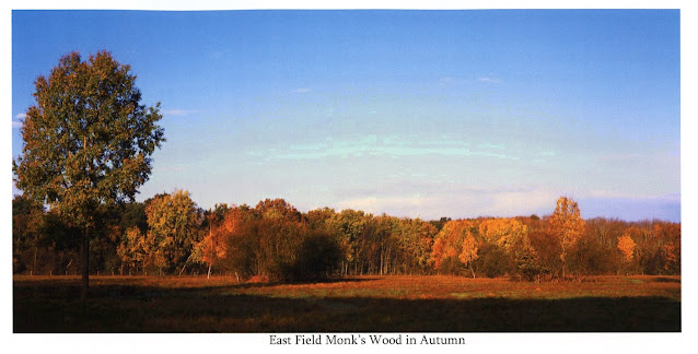
Some Springtime Color

Image
We are entering summer now and what I call the 'tyranny of green'. It is never a very productive time for capturing new images for me. I tend to stick with black and white as a result and spend more time in the darkroom as well. Ironic in that when the weather is nicer I find myself in s small darkened room! I have been taking a few photos with my Mamiya 645 after I had some meter problems which I adjusted. I broke my rule about not shooting black and white and color at the same time. I find each requires a different mind set and alternating film backs can be confusing and not very satisfying.  So I accumulated a roll of images on Kodak Portra 400 over the past month plus. I have a parallel roll of black and white I am not quite through the roll however. Despite mostly being snaps without any real intent artistically a few images came out well. I took most of these with my 150mm f3.5 lens sometimes with the 2x teleconverter. One image was with my 80mm f1.9 which is the widest l

Print Journey Part V-Foggy Path in Aversley Wood

Image
Finally I will explore this image in Lith developer. Lith can be very slow and frustrating but my earlier experience with low contrast images showed some real potential to create a new image. I mostly have 8x10 lith paper (Oriental Seagull) so I will have to opt for smaller images but I will stay with a 16:9 aspect ratio as it suites this image so well. This time I will go for 9x5 on 8x10 paper which is nearly the same ratio (1.8 vs 1.78 for 16:9).  I reviewed my prior posts on lith developing here and here . I then made some notes based on results for Oriental Seagull.  60W lamp 0xND filters No filtration 9x5 image on 8x10 paper Reference point f4 at Ev 2.6 in fog from earlier print Reference point f5.6 @ 45" with 1/2 stop burn where needed 30g Part A Fotospeed Lith 33g Part B Fotospeed Lith I then setup the the enlarger, easel and focus. I found I got Ev 2.5 in a foggy area at f5.6 to match as close as I could what I had done before. I mixed the developer by throwing out half (o

Print Journey Part IV-Foggy Path in Aversley Wood

Image
 As promised in my previous post I decided to pursue a low contrast filter approach to this print. My rationale was that the steep transfer curve of the #5 high contrast filter left me on a knife edge in order to manipulate tonality. Having spent some time in the darkroom this evening I can confirm my hunch was half right. The #00 filter on this image does yield a much greater range of tonality. I ran a test strip at f4 and at f8 (2 stops less light). Each test strip is 3 stops in range so there is one stop overlap. I ended up with over 4 stops of exposure range where some part of the image was visible. With the #5 filter it was probably on the order not more than 3 stops.  What is also clear however that when I reach comparable dark tones of the images I produced with the hard filter there is missing contrast. The hard filter was contributing something toward the final image I produced. I could not expect to reproduce that with dodging and burning either as it si local contrast such a

OnLandscape Magazine: My contribution

For those interested in landscape photography I recommend the online magazine OnLandscape . Published in Scotland and edited by Tim Parkin they produce a very nice monthly edition. I have subscribed for a year now and really enjoy it. It costs £59 a year and arrives promptly every month. Nice color photos from some of the big names and not so big names in landscape photography. I enjoy many of the articles and interviews and especially like getting exposed to different types of landscape work. Every issue grows and challenges my own view of my work which I like.  OnLandscape also has a feature called Subscribers 4×4 Portfolios which gives the opportunity for subscribers to see their work in 'print'. A small biography, some text and the photos and then the hard part... pick four photos. I submitted mine late last year and agonized over which photos and what text to use. It got published in the March issue . I used my Three Wood Lands project as the basis for the submission. It w

Self Published Books Review: Mixam UK

Image
I continue my hunt for the best self-published book maker and I think I have found the best for me. I have some earlier posts here and here about my odyssey of publishing  Three Wood Lands  my book on three Cambridgeshire woodlands. I started out with Blurb, the most obvious. They have a very nice 13x11 inch landscape hardcover. Other publisher like Lulu and Mixam seem to stop at A4 (8.3x11.7 inches) so if a large coffee table book is what you are after look to Blurb or Saar Digital. Still A4 is a great format. Blurb is basically pretty good quality and very high priced.  Recently in Reddit I noticed someone in in the UK had recommended Mixam for a zine (magazine) publisher. Not having heard of them before I looked them up. They do a lot of different printing tasks including hard and soft cover books, zines, posters, flyers, cards, almost everything. They have a great way of quoting work with a series of drop down menus to select the size, number of pages, paper options, and volume to

Photobook: Three Wood Lands the Lulu Publishing Versions

Image
In my introduction post on the culmination of a local woodlands photo project I gave an overview of the process and linked to a video review of the Blurb Publishing version of the book. Now I have my Lulu version so I can compare the two results. First a summary of the major differences.  Attribute                  Blurb                                                            Lulu Size                              13"x11" (330 x 280 mm)                    8.3" × 11.7" (210 × 297 mm) Cover                        Imagewrap Hardcover                         Softcover Pages                         90                                                                 104 Paper                         Lustre Premium 100# (148gsm)        Coated White  80# (118gsm) Price                          US $147.87                                              US $19.03 Before I go into more detail I must reiterate what I said in the earlier post. My experience with Blurb in the pas

Print Journey Part III-Foggy Path in Aversley Wood

Image
After Part II I moved on to taking the 16:9 image to a fiber-based paper print. I have never really come to terms with RC paper though it is enormously cheaper and easier to wash and flatten.  (Ilford has their new portfolio RC paper on a heaver paper base and better emulsion however it is as expensive as fiber-based paper. The various talk about the non-archival nature doesn't really excite me however. I doubt my work will be remembered in 100 years and it is not clear that RC paper wouldn't last that long anyway.) 16:9 Why?  I suppose I should answer why I chose 16:9. Mainly because it was the crop that got me the most from the image while removing distracting elements at the top of the image. Also Flickr's app has this one crop aspect ratio choice. :) I have long had a preference for wider images as well hence my use of 6x17 and 6x12 format images. I have come to enjoy cutting paper down to custom sizes. I often take 12x16 paper to 8x12 or 12x12 for instance.  My wife su