After Part II I moved on to taking the 16:9 image to a fiber-based paper print. I have never really come to terms with RC paper though it is enormously cheaper and easier to wash and flatten.
(Ilford has their new portfolio RC paper on a heaver paper base and better emulsion however it is as expensive as fiber-based paper. The various talk about the non-archival nature doesn't really excite me however. I doubt my work will be remembered in 100 years and it is not clear that RC paper wouldn't last that long anyway.)
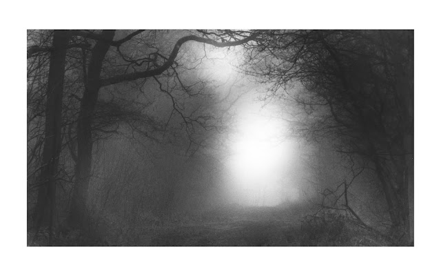
16:9 Why?
I suppose I should answer why I chose 16:9. Mainly because it was the crop that got me the most from the image while removing distracting elements at the top of the image. Also Flickr's app has this one crop aspect ratio choice. :) I have long had a preference for wider images as well hence my use of 6x17 and 6x12 format images. I have come to enjoy cutting paper down to custom sizes. I often take 12x16 paper to 8x12 or 12x12 for instance. My wife suggested that part of the appeal of 16:9 is that it is cinematic/HDTV and perhaps our brains have been trained to like this aspect ratio.
Print Size
I computed a close approximation to fit on 12x16 paper with wide borders and I settled on 14"x8" (1.75 vs 1.78 for 16:9). I trimmed the paper to 16x10" to allow 1" borders all around. I used Ilford MGFB Classic paper with a matte finish.
I thought this would be a quick straightforward process now that I had a dodge and burn process for a print I liked on RC paper. However it wasn't that happy a process. Kentmere VC reacts quite differently than Ilford MG FB Classic. I also find that as a print is enlarged the importance of tonal areas shifts and requires attention.
I setup the baseboard and enlarger and selected an aperture to get me to a similar Ev as I had with the RC print. I know Kentmere VC Select runs faster than most other papers but this is a starting point. The result of the larger image was I move the aperture from f8 to 5.6.
At f5.6 using the same exposure times and dodges a burns resulted in a lighter print.
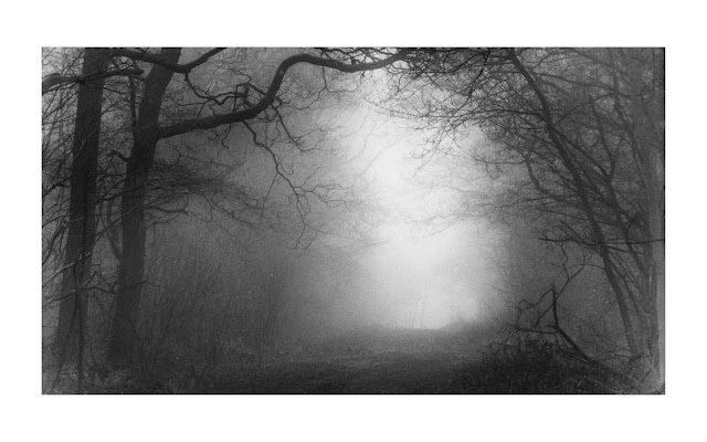 |
| f5.6 #5 64 second. Burn left corner 22" dodge top 10" bottom 7" |
I went darker next at f4 by adding 1/2 stop exposure.
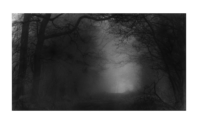 |
f4 #5 45 second. Burn left corner 16" dodge top 5" bottom 3"
|
While this has its own vibe I am looking now to go lighter. I seem to be on the sharp edge of the #5 filter where small changes make big swings. (More on this later.)
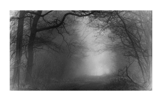 |
| f4 #5 54 second. Burn left corner 16" dodge top 7" bottom 5" |
It is also apparent the the left and right sides need more burn. This was less apparent in the smaller RC image.
I made a final image which is where I left the session a couple of weeks ago (I do not have a scan of it however.). I used a 39" overall exposure and adjusted the dodges and burns proportionately. I thought this was the final image but as I looked at it more I became dissatisfied. It has a lot of vague detail (good!) in the lighter tonal areas but I wanted something brighter and more luminous in the brighter sections. So late last week I endeavored to revisit the image.
My first thought was perhaps I should bleach the print. This has the ability to brighten highlights while affecting shadows less. I should get more contrast and perhaps boost the luminosity. I took the above print and bleached it in my 1+9 working potassium ferricyanide solution for about 4 minutes. It was beginning to have the color of the image affected at this point (faint magenta/purplish cast) so I stopped. It seems to help but I wanted to go further. The bleached version is below.
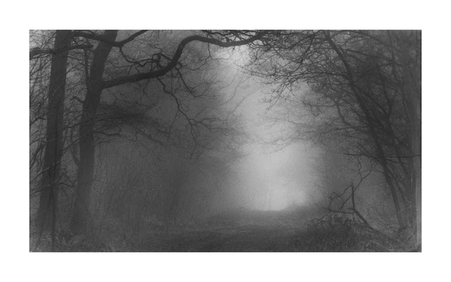 |
f4 #5 239" overall 10" and 8" dodge with 13" corner burns then bleached 4 minutes.
(Photoshop borders image 6) |
I went through 3 more attempts to get what I wanted with more dodging until I got what looked natural. I took extensive notes for my dodge and burn plan but so much is subjective in terms of movement and placement and dwell over areas. . I also had an insight that I will explain at the end.
 |
f4 #5 27" overall 12" and 16" dodge with 16" corner burns.
(Photoshop borders image 9) |
I loose some of the detail in exchange for the greater luminosity. This seems to be inevitable. In the end both are good prints for their own reasons.
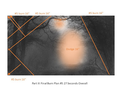 |
| Burn Plan III |
Conclusions
I was glad I put some more effort in as I think I moved the image in a more favorable direction. The insight I gained amongst this and intend to explore is that low contrast images like this probably don't really care what filtration I use. (What I am saying is the image is in fog and so one cannot get nor should one expect a higher contrast image to emerge. If it did then why bother shooting in the fog if in the end the mood is removed. )
I have been chasing high contrast (#5) filtration exclusively but the downside is the extreme sensitivity to variations in exposure. the high contrast filter changes tone with relatively little change in exposure. I have written about this in the past. Indeed looking at test strips of the #5 filter one tends to see nothing for increasing exposure until some point is reached and the shadows build quickly with increased exposure. This is of course entirely the point and why split filter printing works.
The trouble is that if I am dodging and burning the low contrast for scenes and steering for just the right darkness and lightness living on this knife's edge means I seem to keep hunting back and forth and timings are relatively unforgiving when dodging and burning.
I intend next to print this again with the #00 filter to see if I can get a pleasing result and how much easier it is to manipulate the exposure.


Comments